
Presented by Jim Bennett, author of Calligraphy For Dummies
Issue #1
|
Edward Johnston: A Foundational Figure in Modern Calligraphy
 Edward Johnston (1872–1944)
revolutionized the art of calligraphy through his revival
of historical scripts and influential teaching. His legacy
shaped generations of calligraphers and typographers.
Edward Johnston (1872–1944)
revolutionized the art of calligraphy through his revival
of historical scripts and influential teaching. His legacy
shaped generations of calligraphers and typographers.Widely regarded as the *father of modern calligraphy*, Johnston was born in Uruguay and raised in England. He initially studied medicine before turning to the arts. His fascination with medieval manuscripts led him to explore historical letterforms, particularly those of the 10th-century English scribe tradition. At the Central School of Arts and Crafts in London, Johnston emphasized craftsmanship and historical accuracy, laying the foundation for a modern revival of calligraphy.
One of Johnston’s major contributions was his reintroduction of the **broad-edged pen** as a primary tool for formal writing.
By the late 19th century, the broad-edged pen had largely fallen out of use, supplanted by the pointed pen, which was favored for copperplate and Spencerian scripts. These styles—with their fine hairlines and dramatic swells—were well-suited to steel nibs and the demands of business correspondence and engraving. Johnston saw this shift as a loss of the architectural clarity and rhythm found in medieval and Renaissance manuscripts.
His revival of the broad-edged pen was a deliberate return to historical letterforms, emphasizing structure, proportion, and the expressive potential of stroke contrast. This reintroduction was not nostalgic—it was a modern reclamation of form and meaning in an age of mechanical reproduction.
Johnston is noted for teaching what he called the **Foundational Hand**, a simplified and elegant alphabet based on Carolingian minuscules, designed for beginners. His studies of **Roman capitals and uncials**, which he researched and adapted from historical sources, helped establish the true stylistic lineage of our alphabet. He emphasized rhythm, proportion, and spacing—treating letters as architectural forms.
 His teaching method was
rigorous yet poetic, encouraging students to understand
the *structure and spirit* of letterforms, not just their
appearance. Johnston's calligraphy is illustrated on the
left.
His teaching method was
rigorous yet poetic, encouraging students to understand
the *structure and spirit* of letterforms, not just their
appearance. Johnston's calligraphy is illustrated on the
left.Johnston’s Students and Legacy
Johnston’s influence extended through a remarkable lineage of students:
- **Eric Gill** – Sculptor, type designer (creator of Gill Sans), and letterer.
- **Graily Hewitt** – Prominent illuminator and advocate of gilding techniques.
- **Percy Smith** – Calligrapher and teacher who continued Johnston’s educational legacy.
- **Dorothy Mahoney** – Assistant and later teacher at the Royal College of Art; mentor to Sheila Waters (see her forthcoming bio).
- **Irene Wellington** – Known for her formal commissions and teaching at the Royal College of Art.
- **Ann Camp** – Author of *Pen Lettering* and influential educator.
These students and their successors helped establish calligraphy as a respected art form in the 20th century, influencing type design, signage, and book arts.
Johnston’s Book: Writing & Illuminating & Lettering
 Published in 1906, Writing
& Illuminating & Lettering is Johnston’s
seminal work. It offers:
Published in 1906, Writing
& Illuminating & Lettering is Johnston’s
seminal work. It offers:- **A comprehensive guide** to the art and craft of calligraphy, illumination, and lettering.
- **Detailed instructions** on tools, materials, and techniques, including how to cut quills, prepare ink, and plan manuscripts.
- **Historical context** and philosophical reflections on the beauty and utility of letters.
- **Illustrations and diagrams** that clarify the construction of alphabets and layout principles.
This book remains a cornerstone for students and professionals alike, blending technical precision with artistic insight.
Hands-On Project: Designing Monograms -- A Classic Touch with Calligraphic Flair
Monograms remain one of the most beloved forms of calligraphic ornamentation. While they’re most commonly seen on stationery, their versatility makes them ideal for programs, napkins, signage, and more—especially at weddings. (For a deeper dive into wedding-specific designs, see Chapter 20.)
Creating a well-balanced monogram involves two essential steps:
- Sketch generously. Explore a variety of letter forms to see which styles harmonize best.
- Refine and letter. Choose your strongest concept and render the final version with care.
Most traditional monograms feature three capital letters, with the center letter being the largest and most prominent. This central letter typically represents the last name, flanked by two smaller initials—often the first names of the individuals involved. In wedding contexts, these are usually the initials of the bride and groom.
The strongest monogram designs emerge through a process of discovery and refinement—sketching, re-sketching, and adjusting until the composition feels visually unified. If you’re new to monogramming, expect it to take time. But with practice, your eye for balance and style will sharpen.
A Useful Shortcut
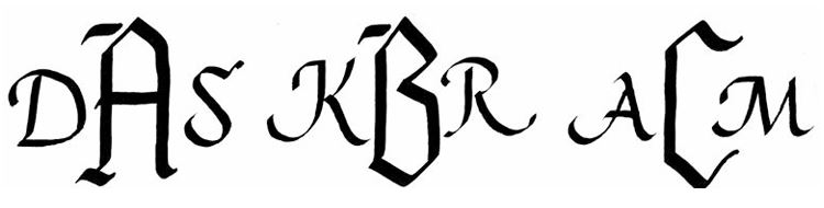
To simplify the process, consider using a center letter with straight vertical sides. This allows the side letters to nestle closely, helping the trio read as a single cohesive unit. Such letters are often inspired by Blackletter forms (see Chapter 8), built from diamond, vertical, and diagonal strokes.
The figure below illustrates three examples of monograms using this approach. Notice how the smaller side letters were executed with a different nib size than the central letter—an elegant way to emphasize hierarchy and maintain visual clarity.
Behind-the-Scenes Reflections
(Step into the studio with short notes, sketches, and musings on the creative process, including glimpses into Jim’s own artistic journey.)
December settles in with its chill, and my studio feels it keenly. I hesitate to turn on the heat—partly to save the expense, partly because the cold seems to invite a slower pace, a time for reflection and setting new goals.
This season brings excitement too: the second
edition of Calligraphy for Dummies
will be available just in time for Christmas. I noticed
Amazon offering it at an unbelievable price—though who
knows how long that will last!
I'm finishing up newgoldenletters.com just in
time.
Looking ahead, I’m preparing for a busy start to the new year. My artwork will be on exhibit during January and February at the Stanfordville Library in New York, and I’ll also be teaching a four-session Zoom class on the Golden Age of American Illustration.
Closer to home, the holidays call for tradition. We’re making our annual batch of our family’s hot pepper jelly—a fiery-sweet staple at our table. (If you’d like the recipe, drop me a note.)
So while the studio may be cold, the days are full of warmth, anticipation, and creative energy.
Curated Inspirations:
(Thoughtful quotes, illustrative flourishes, and design ideas to keep your creativity flowing.)
A short quotation:
“Winter’s quiet conceals a hidden truth: creativity, like roots, grows strongest in stillness.”
And a longer version:
“Winter may seem a season of stillness, yet beneath the frozen ground roots are weaving their strength. In the quiet, creativity germinates—ideas gathering warmth, waiting for the moment to rise. Let this cold season remind us that growth often begins unseen, and that patience is the companion of renewal.”